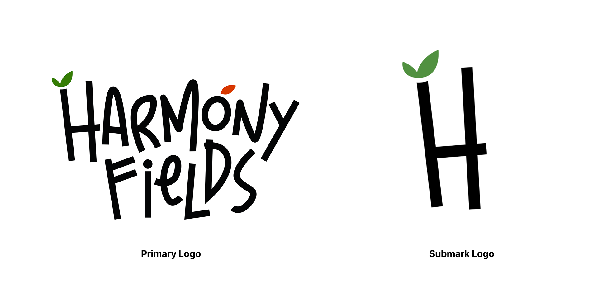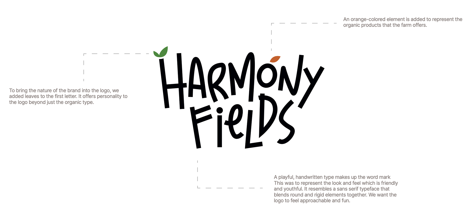
Harmony Fields
Brand Identity Design
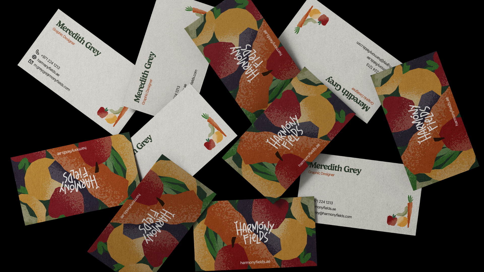
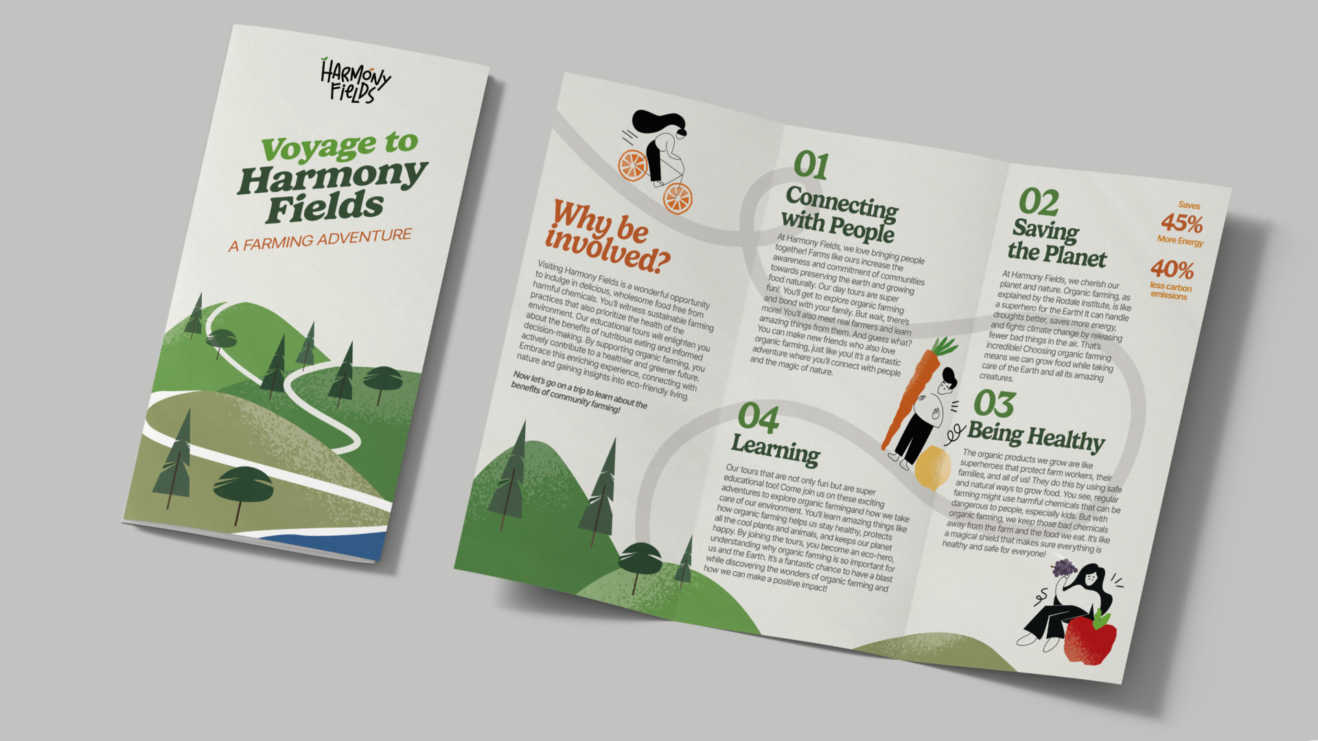
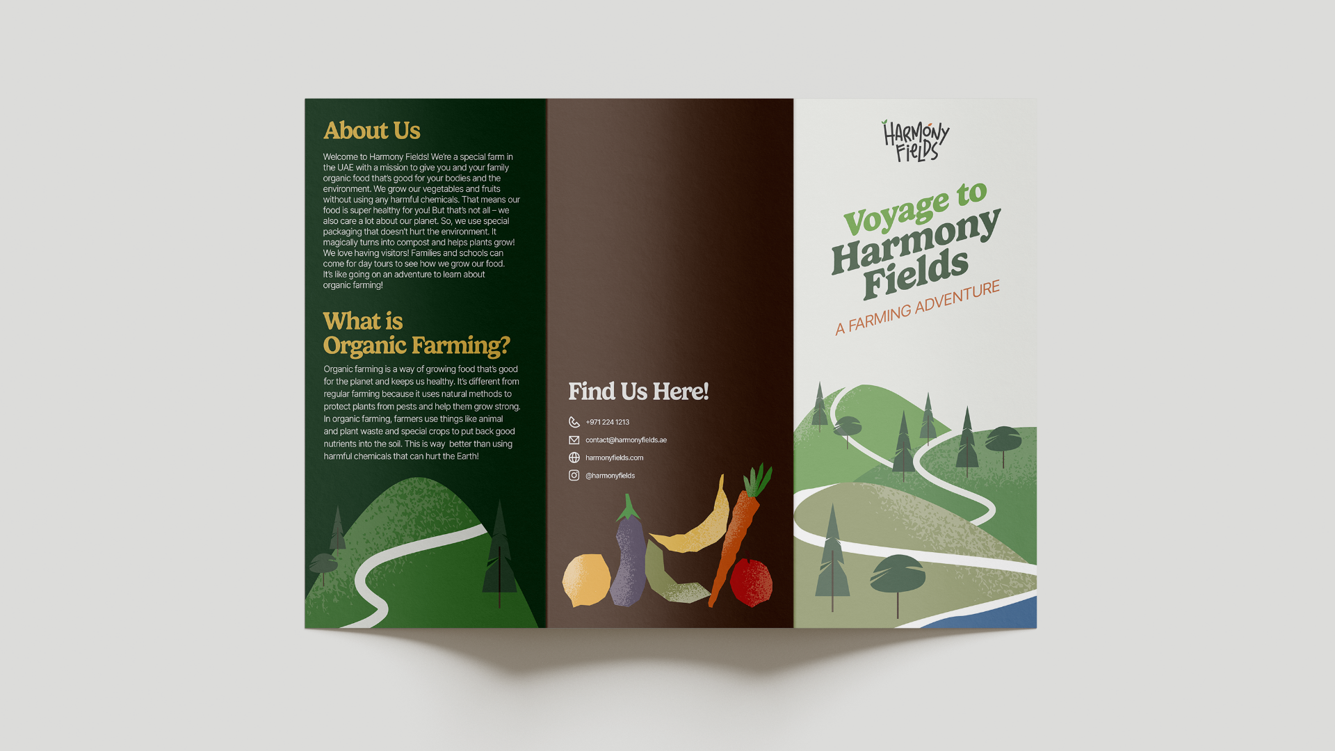
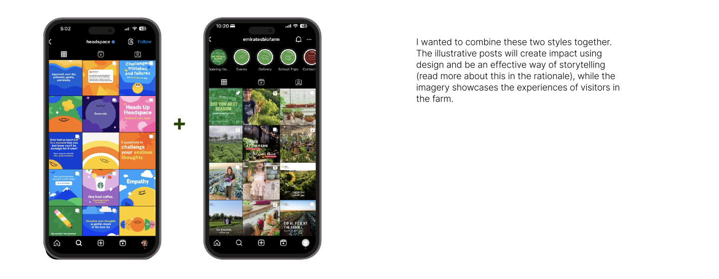
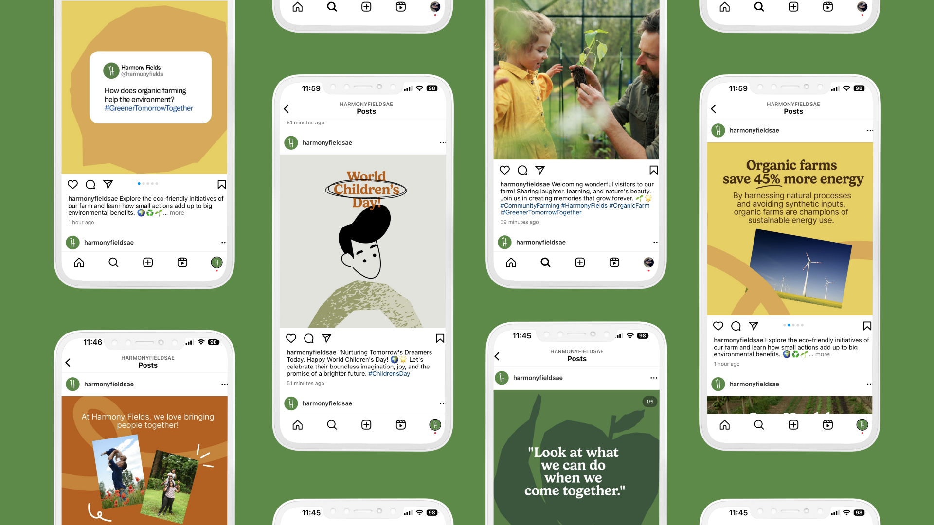
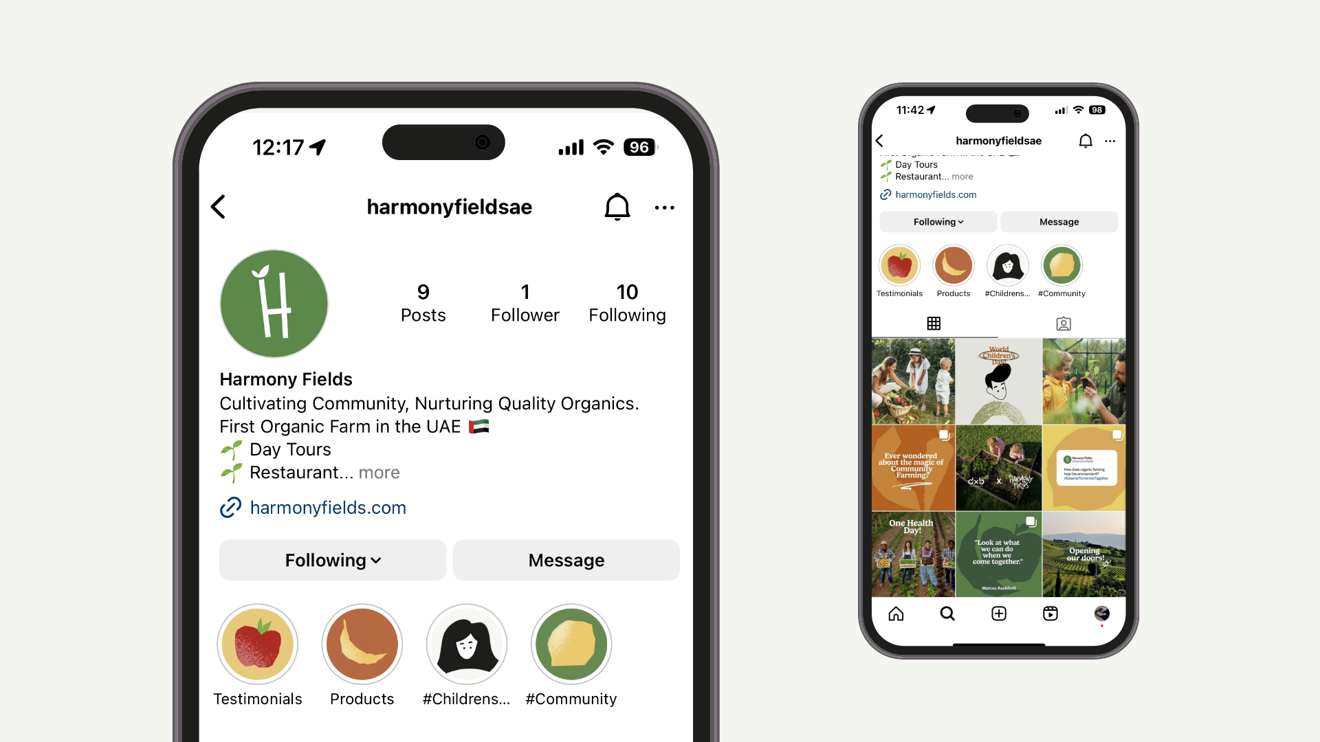
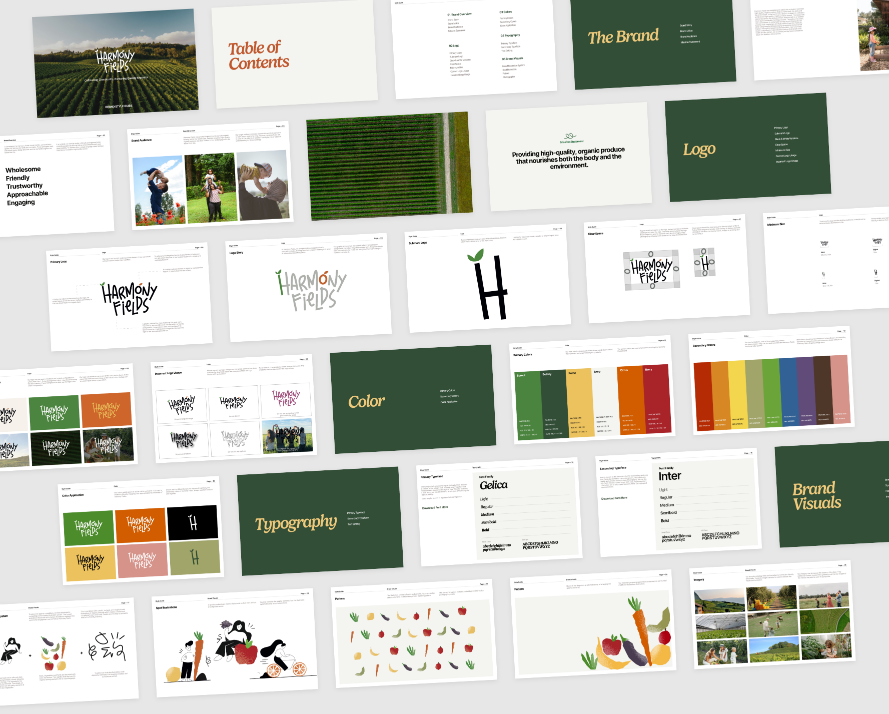
A vivid and fun illustrative identity for an organic farm. Harmony fields is dedicated to providing premium organic produce that nurtures both the community and the environment.
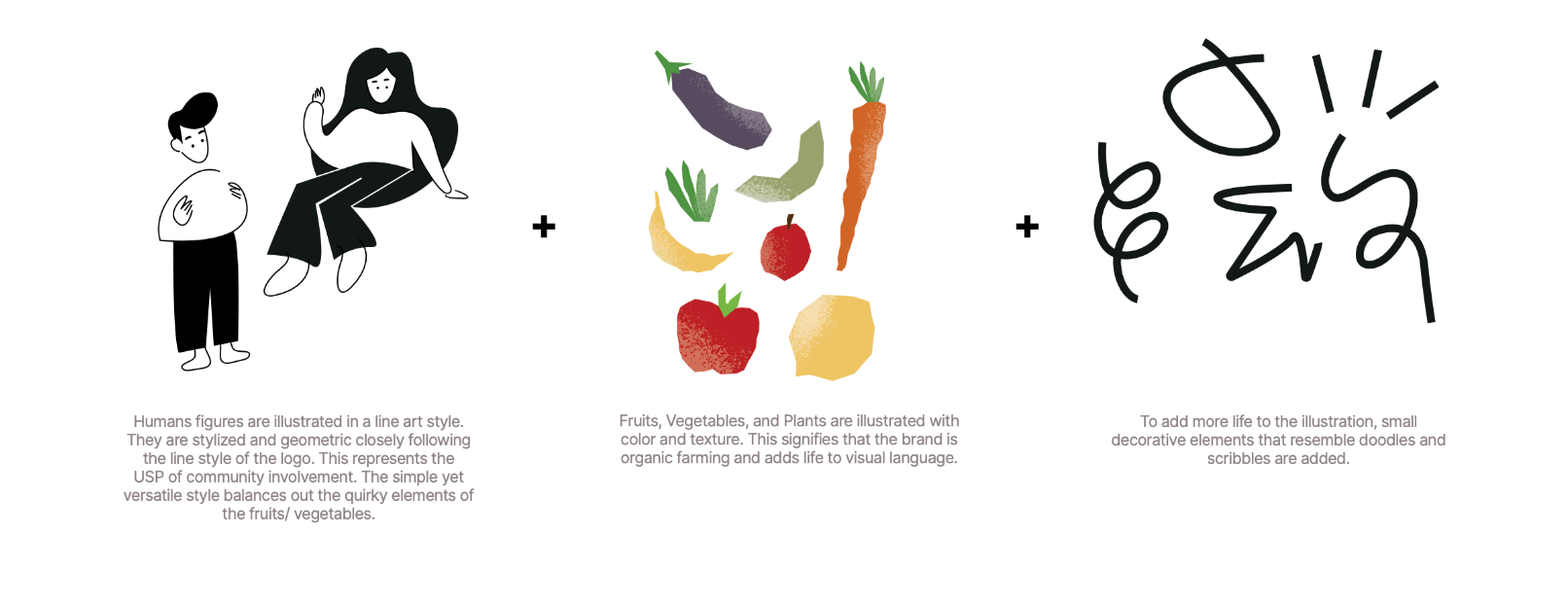
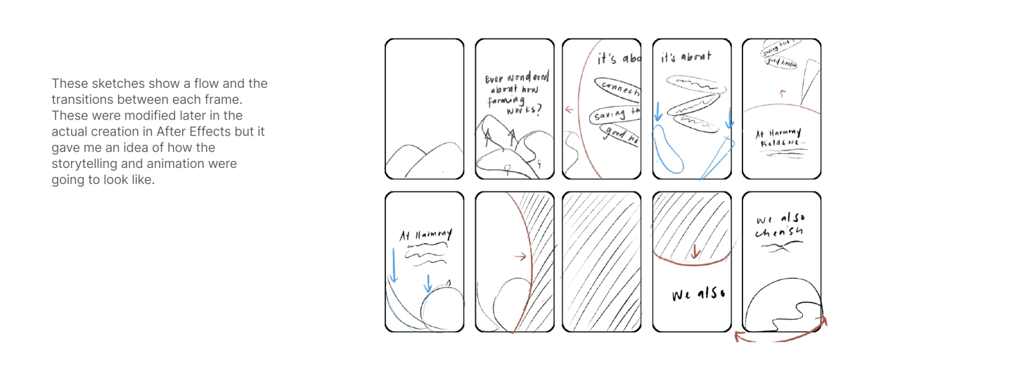
Rooted in the visual language “Refined Playfulness, the identity for Harmony Fields is characterized by illustrations with clean lines, fun sans serif typography, and imagery that both reflect the community and
.
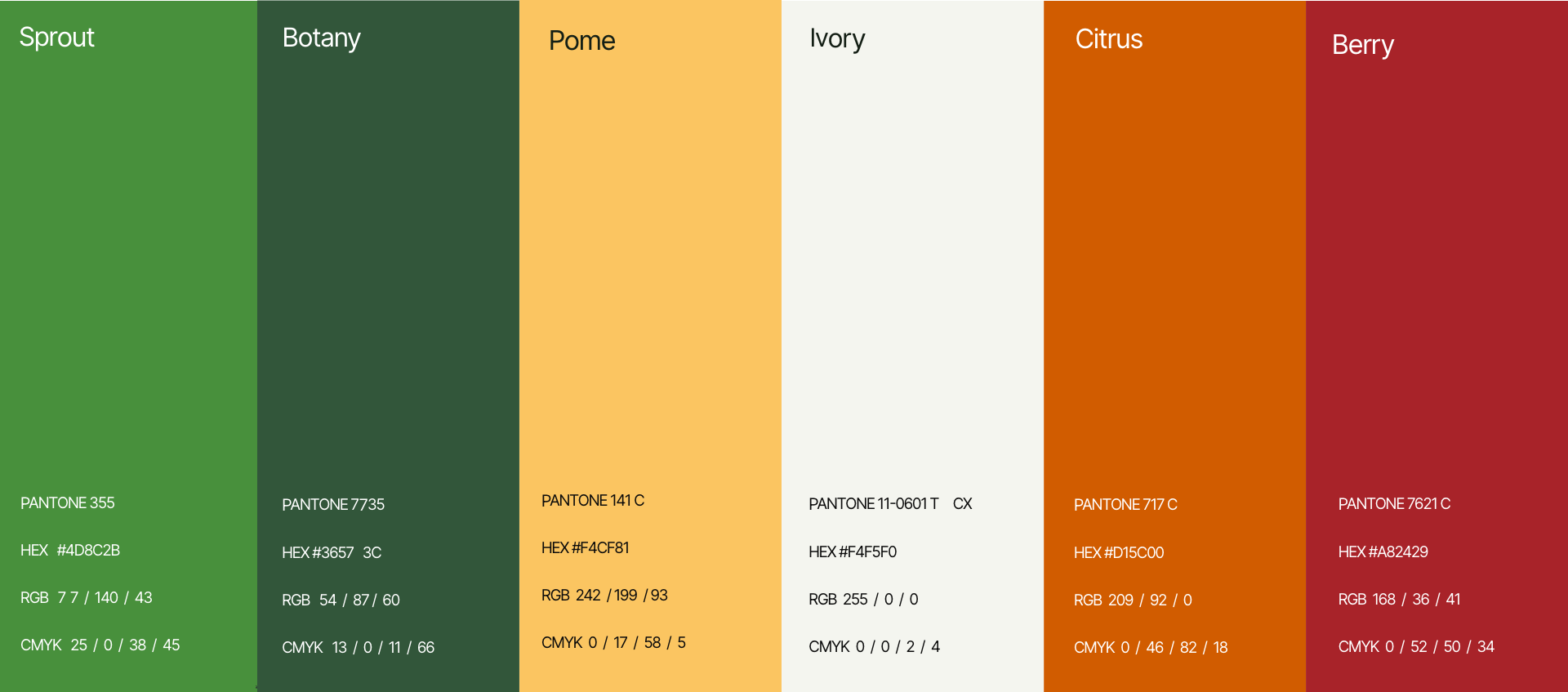
In developing the Harmony Fields visual identity, I was guided by the brand voice: "Wholesome, Friendly, Trustworthy, Approachable, Engaging" These have influenced every design decision and can be felt throughout the brand identity.